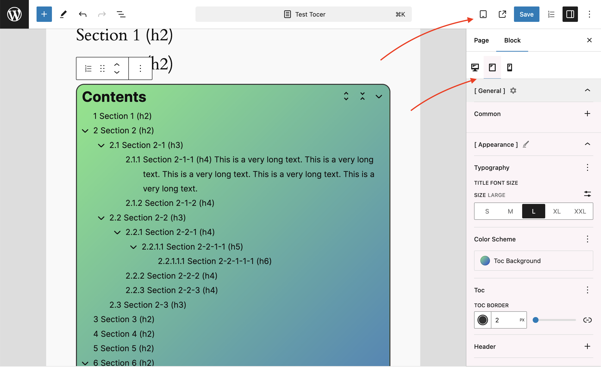
Customize the user interface for each device type—Desktop, Tablet, and Mobile. This allows you to tailor the layout, styles, and functionality to fit the specific screen size and resolution of each device, ensuring a seamless and optimized experience for all users. Whether it’s adjusting font sizes, spacing, or color of certain elements, you have control over how your content is displayed on different platforms.
Responsive UI
3 responses to “Responsive UI”
-
It’d be really handy if we could set the screen size for mobile and tablet! Is there a way to do this by editing the plugin files directly? I know the changes will get overwritten with each update, but I’m fine with that. Could you let me know which file to edit and where to find it, so I can tweak the screen size that triggers the ‘tablet’ and ‘mobile’ settings? Thank you!
-
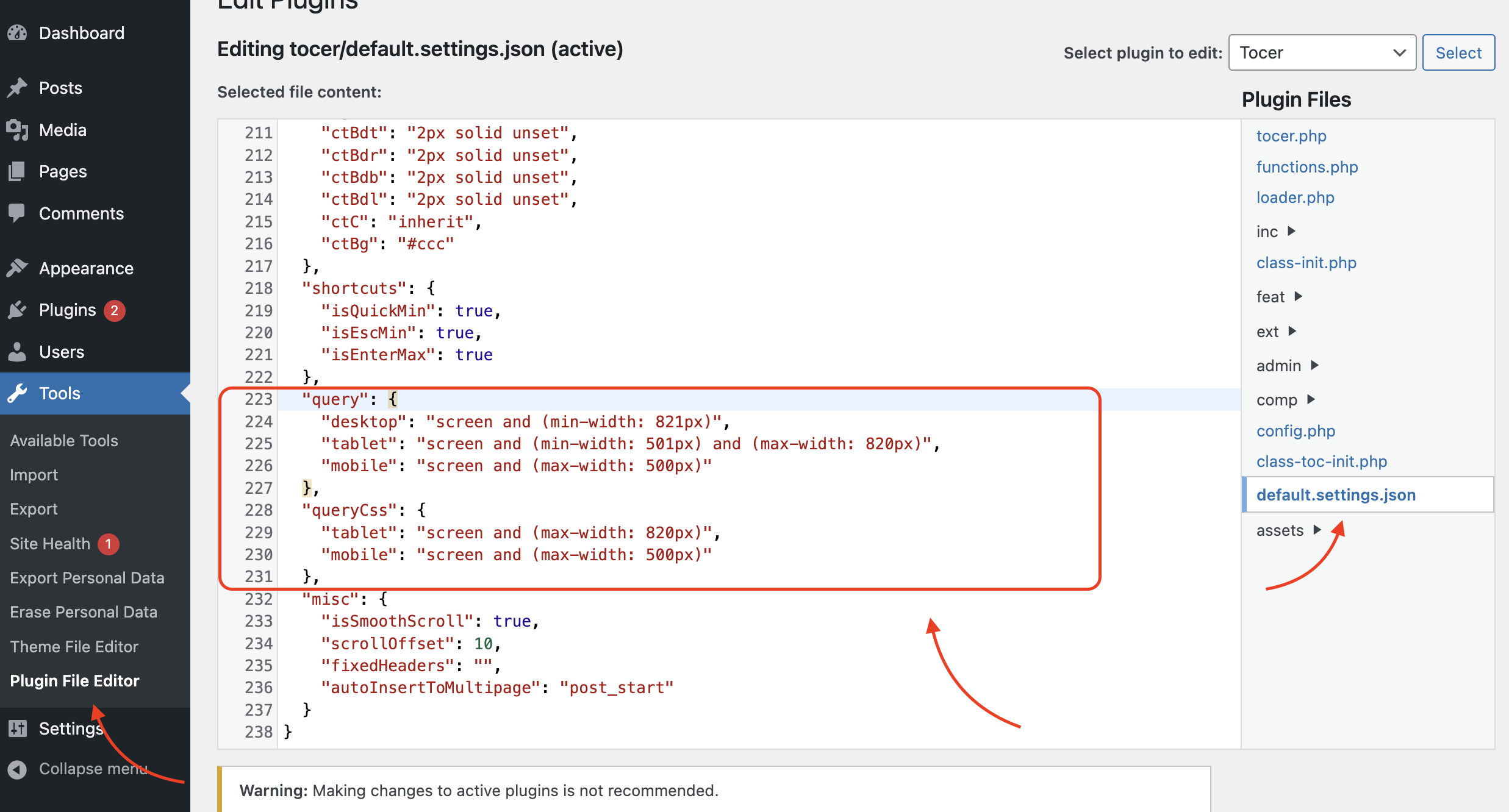
Change the ‘query’ and ‘queryCss’ fields.-
It works, thank you! This plugin is awesome!
-
-
Leave a Reply to Matt Cancel reply